
Blog
Tips & Tricks
11 Framer Features Worth Actually Understanding in 2026

Ryan Hayward
Framer moves fast. Like, really fast.
Over the past 12 months, the editor UI has been overhauled, new effects have shipped, the Insert panel was rebuilt from scratch, and features that used to require plugins or workarounds are now native. If you learned Framer from a tutorial that's even six months old, there's a decent chance some of what you were taught looks different now - or doesn't exist in the same place.
This post covers 11 features worth actually getting your head around - what they do, how to use them, and why they matter.
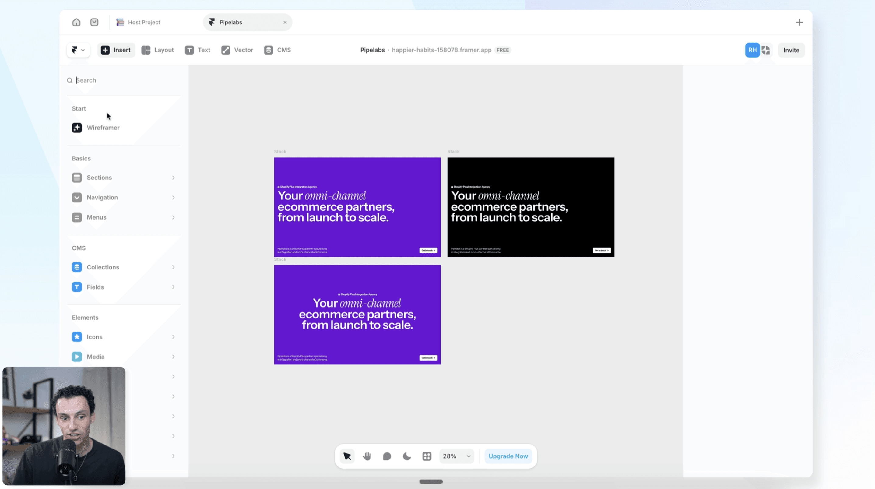
1. The Framer editor, properly
The Framer UI changed significantly in 2025. The Insert panel was rebuilt entirely with Insert 2.0 - pages and section templates now live directly inside it. Then in September 2025, Framer completely re-engineered the Pages and Assets panels, adding multi-selection, bulk actions, and new organisation tools. If you've been Googling why your editor looks different to older tutorials, that's why.
The editor has three core areas: the canvas in the center where you build, the layers panel on the left showing your page structure, and the properties panel on the right for styling and settings. If you've used Figma, the logic is familiar - but Framer adds a layer that Figma doesn't have. Everything you build is a live website. There's no export, no handoff, no separate dev step. What you see on the canvas is what gets published.
Getting comfortable with the editor properly - not just stumbling through it - is what separates people who build clean, maintainable sites from people who hack things together and hope for the best.
2. How to build a responsive navbar that actually works on mobile
This is one of the most common things people struggle with. Building a navbar that looks great on desktop and collapses cleanly into a hamburger menu on mobile - done the right way - trips people up constantly.
Here's the correct approach in Framer:
First, draw a new frame for your navbar. Set the width to 100% and the height to fit content. Turn on layout and set distribute to space between - this pushes all the elements inside the navbar as far apart from each other as possible, which is exactly what you want.
Add your logo, group your navigation links in their own stack (select them all, right-click, Add Stack), and add a button on the right. Set the nav links stack width to fit content.
The key to making the hamburger menu actually work is component variants. Turn the navbar into a component, create a second variant for the mobile state, and use a conditional interaction to swap between them at your mobile breakpoint. This is what drives the hamburger toggle without any code.
Set each nav link as a proper link element, not just text - this matters for SEO and accessibility, not just functionality.
3. Ticker effect - how to create infinite scrolling content
If you've seen that endless scrolling row of logos or text on a website and wondered how to do it in Framer, it's actually really simple. Framer has a built-in ticker effect.
Here's how it works:
Put your content inside a frame with layout turned on, direction set to horizontal. Your images or elements will overflow the frame - that's intentional. Go to Effects on that frame and select Ticker. Click Play and watch it scroll.
You can control the default speed, the speed on hover, and the direction (left or right). There's also a draggable option, which means visitors can click and drag to speed it up or slow it down.
The hover speed setting is worth playing with. Setting it to 50% means it slows down when someone hovers over it - a nice interaction because it draws attention without being annoying.
One thing to know: the effect loops automatically - you don't need to duplicate your images to make it repeat.
4. Design pages - Framer's canvas for exploration
Most people don't know this exists.
Framer has two types of pages: web pages (which appear on your published site) and design pages (which don't). Design pages are an infinite canvas inside your project - no breakpoints, no publish button, no restrictions. Nobody sees what's in here unless they're inside your Framer project.
The practical uses are broader than they might sound. You can use a design page to try five different hero section layouts before committing to one on your live site. You can map out your design system, plan component structures, or use Wireframer to generate rough page layouts that you then copy across to your actual pages.
The key distinction: a web page appears on your website. A design page belongs to Framer. It just lives in the project.
One limitation worth knowing: you can't apply effects directly on a design page. But you can create an effect on a web page, copy it, and paste it into a design page to preview it - you just can't edit it there.
5. Overflow - and the one thing everyone gets wrong
Overflow is one of those properties that everyone thinks they understand until something breaks.
There are four overflow types in Framer:
Clip: the default on any new frame. Cuts off content that extends beyond the frame boundary. Works with sticky positioning.
Visible: lets content overflow and remain visible beyond the frame. The frame still controls layout sizing, but nothing gets hidden.
Hidden: hides all overflowing content completely. On the surface it looks identical to clip. Behind the scenes, it's different - and this is the one that catches people out.
Here's the thing: hidden overflow breaks sticky positioning. If you've ever built a sticky nav or sticky sidebar that suddenly stops working for no obvious reason, check the overflow on every parent frame. A parent set to hidden will break sticky on any child inside it. Clip doesn't have this problem.
Scroll - keeps content contained within the frame but makes it scrollable. Really useful for horizontal image galleries, scrollable lists, or any case where you want the content contained but still accessible.
The practical rule: clip is the right default for almost everything. Only use hidden when you specifically need to hide overflow without wanting sticky positioning. Only use visible when you want content to deliberately extend outside its frame.
6. SEO in Framer - the things that actually matter
Just because you have a beautiful website in Framer doesn't mean anything unless people can actually find it. Without optimizing your site for search engines, you won't be discovered by Google or ChatGPT, which means no customers and a site that exists in a vacuum.
Search engines work in three stages: crawling (bots discover your pages by following links), indexing (those pages get stored in Google's database), and ranking (Google decides which indexed pages are most relevant to a search query). You want to optimise for all three.
Start with your site settings. Your site title should be 50-60 characters. Your description should be 150-160 characters. Use words people would actually search for. Framer shows you a preview of how this will look in Google search results, which is useful.
Get a custom domain. The .framer.app domain isn't discoverable by search engines, and you're essentially competing with everyone else using it. If you're building a real site - for a client or yourself - a custom domain isn't optional.
Set up redirects. If you change a page URL or you're migrating from an older site, old links to those pages will still exist on the internet. Someone following an old link that hits a 404 tells Google your site is broken - and that hurts rankings. Framer's site settings have a redirects panel. Use it.
Use your sitemap. Any Framer site's sitemap is accessible at yourdomain.com/sitemap.xml. Every publicly accessible page shows up there. If you want to hide something from search engines, you can disable it in Framer's page settings.
CMS pages get individual SEO. You can pull CMS field variables directly into your SEO title, description, and social preview image. So each blog post or product page gets unique metadata automatically. Set this up in the page settings of your CMS template.
Heading hierarchy matters. H1, H2, H3 text styles in Framer aren't just a design choice - they tell search engines what's important on each page. Set these up under Styles in your Assets tab.
Alt text on images. Describes your images to search engines and screen readers. Select an image, go to Fill, and add a description. Be specific - "photo" is too vague. There's a plugin called Alt Text Go that uses AI to generate alt text for every image in your project at once. Worth using.
Test your performance. Go to lighthouse-metrics.com and run your site. Page load speed, mobile responsiveness, and bounce rate all affect how you rank.
7. Wireframer - what it's actually useful for
My belief is that designers who can not only design with great taste but also build and publish will have a really critical role in the future - because we're the people with taste. But it's worth being honest about what AI tools in Framer are and aren't good for yet.
Wireframer is Framer's built-in AI page generator. You access it from the Insert menu. Type a prompt - something like "create a landing page for a SaaS product with a pricing section and contact form" - and it generates the structure of that page as actual Framer elements.
What it produces is a wireframe, not a finished design. All the elements and frames and layout logic are there, but the visual direction is completely generic. That's actually the right approach, because AI genuinely isn't at a point where it makes good design decisions. The structure it generates is solid. The design choices are yours to make.
To be completely honest, I rarely use Wireframer because I like to teach from scratch. The layouts it produces are fairly cut and paste - you won't get a different visual direction each time. But if you're still getting comfortable with how to structure a site in Framer correctly, it generates well-structured output that you can learn from. It's a starting point, not a time-saver for experienced builders.
8. Accessibility in Framer - what it is and how to do it
Think of a website like a house with lots of rooms. Most people can navigate it easily. Others use tools like screen readers or keyboard navigation to get around - and those tools need your site to be set up in a way they can understand.
Accessibility in Framer comes down to four things:
Alt text on images. Describe every meaningful image. Select it, go to Fill, add the description. Be specific but don't write an essay. The goal is for someone to understand the image in one or two sentences. Use the Alt Text Go plugin to generate alt text with AI across your whole project at once.
Color contrast. This is the difference in lightness between your text and its background. If they're too similar, text is hard to read - especially for people with visual impairments. The Color Contrast plugin lets you select two colors and check whether they pass accessibility standards. Run it before you publish.
Typography and readability. Font size, line height, and heading hierarchy all affect readability. Use proper H1, H2, H3 text styles in Framer - they create structure that screen readers can parse, not just visual hierarchy.
Accessibility settings in Framer. Inside your page settings, there are accessibility-specific options for focus states, keyboard navigation, and ARIA labels. These exist specifically for users who navigate with keyboards or assistive technology.
Accessibility and SEO overlap significantly - both rely on alt text, heading structure, and page performance. Getting one right tends to help the other.
9. Dynamic filtering - native CMS filtering without plugins
If you have a CMS collection with a lot of items - properties, blog posts, products, events - letting visitors filter through them used to be a real pain. You either went deep into components and overlays, or used a third-party plugin. Framer now handles this natively.
There are two types of filters: static and dynamic.
Static filters apply a condition to the entire collection and aren't changeable by visitors. For example: "only show items where Status = Published." You set it, it applies, that's it.
Dynamic filters let visitors choose their own filter criteria - like a search box that filters a blog by category, or Airbnb-style property filters.
To set up dynamic filtering:
Select your collection list
Go to Content, then Filters
Choose the CMS field you want to filter by
Set it to Dynamic
Choose the filter type - search, tabs, toggles, dropdown, or checkbox
The filter element gets added to your page and behaves like a form input in terms of styling. Position it where you want it, style it to match your design, and the collection list updates automatically. No extra setup needed.
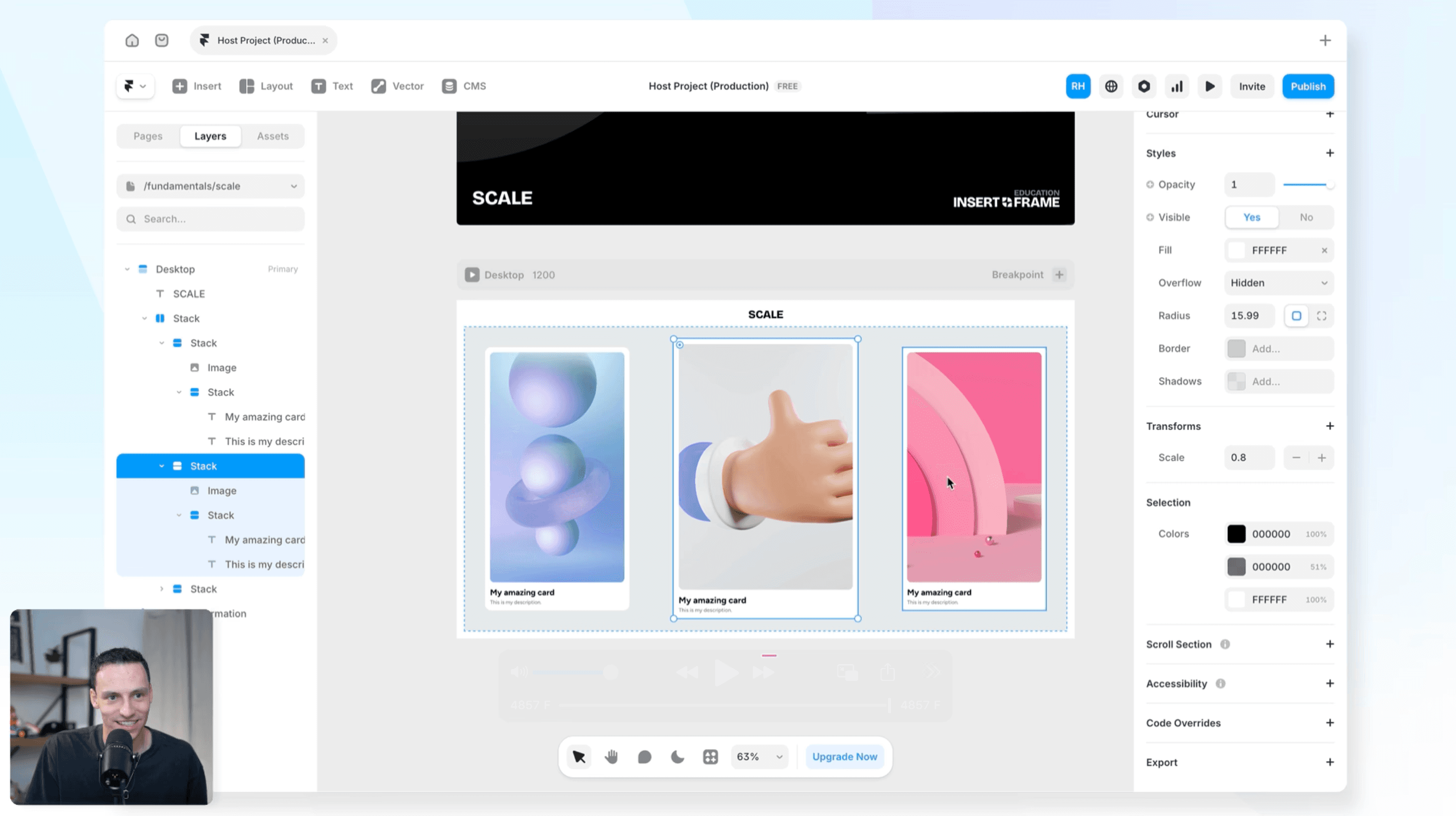
10. The scale tool - two different things, both useful
There are some features in Framer that are genuinely handy but aren't obvious until someone shows you. The scale tool is one of them.
There are actually two different types of scale in Framer:
Transform scale: found in Properties, under Transform. This scales the visual appearance of an element without changing its actual values. A text layer set to 16px remains 16px in the properties panel, but looks smaller on the canvas because everything is being scaled down visually. Useful when you want a visual resize without touching any of the underlying property values.
K shortcut: select any frame and press K. This activates a different type of scale that actually changes the real dimensions of everything inside. Scale up by 1.33x and that 16px text becomes 21px. All the padding, gaps, and sizes update proportionally.
Where K scale saves real time: if you've built a component or section and realised it needs to be 20% bigger or smaller, pressing K and dragging is a lot faster than manually adjusting every text size, padding, and gap.
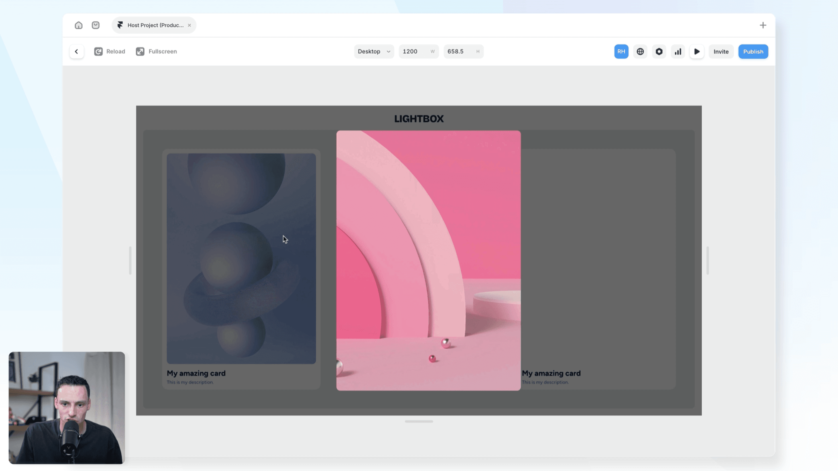
11. Lightbox effects
Used to require components, overlays, and a fair bit of trickery. Framer added a native lightbox effect that takes about 30 seconds to set up.
Select any image. Go to Effects. Choose Lightbox. Done.
When a visitor clicks the image on your published site, it opens in a modal overlay centered on the page. You can adjust the max width, padding, backdrop color, z-index, and the transition style.
It also works with images inside CMS collection lists - which means every image in a gallery or product list gets the same lightbox behaviour automatically, without any extra setup per item.
Copy the effect from one image and paste it onto others to apply it quickly across a page.
Why Framer knowledge goes out of date fast
The reason all of these features are worth knowing about isn't just that they're useful - it's that Framer's pace of shipping means things change quickly, and tutorials age fast.
The Insert panel looked completely different 12 months ago. The Pages and Assets panel was rebuilt from scratch in September 2025. Dynamic filtering didn't exist natively until recently. Lightbox was a manual component hack.
If you're learning Framer right now, the most important habit you can build is staying close to Framer's official updates page and being willing to relearn things when the tool moves. The fundamentals - frames, stacks, components, breakpoints - stay the same. The specific panels, features, and workflows keep evolving.
The best place to learn Framer is, honestly, right inside Framer. But if you want a streamlined course that takes you from zero to mastery fast, check out the Ultimate Framer Masterclass course. Keep building.
KEEP READING

Frameship 2.0 Update
Frameship has had HUGE upgrades

Georgia Back

How to manage projects in Framer
Project management can get out of hand quick, here are our best tips to keep everything on track

Insert Frame

I Left Client Work to Sell Templates on Framer: Here's What Happened
We speak to Anatolii about his journey with Framer and being a freelancer.

Anatolii Dmitrienko