
Blog
Tips & Tricks
How to Make a Responsive Navbar and Hamburger Menu in Framer

Ryan Hayward
Responsive design is the number one issue that never seems to go away. You can get everything right - colors, copy, animations - and it's all meaningless if the navbar falls apart on mobile. Here's how to build one properly.
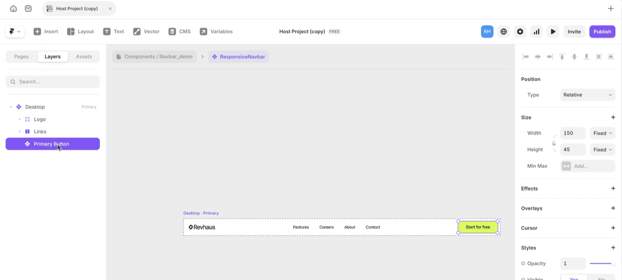
Step 1 - Create the navbar base
Press F to draw a new frame on the canvas
Set width to 100%, height to fit content
Turn Layout on and set Distribute to Space Between
Add 15px padding on all sides
Step 2 - Add the navbar elements
Add your logo on the left
Press T and create your nav links - Features, About, Contact
Select all nav link text layers, right-click, choose Add Stack
Set the links stack width to Fit Content
Add a CTA button on the right
Step 3 - Turn it into a component with variants
Select the entire navbar frame, right-click, choose Create Component
Rename the first variant Desktop
Click Add Variant, rename it Mobile Closed - resize to 390px, hide links (opacity 0), reduce height to 60px
Click Add Variant, name it Mobile Open - set Content stack to Vertical, make links visible
Step 4 - Build the hamburger menu icon
Draw a small frame, add two thin horizontal rectangles inside as menu lines
Convert to a component with two variants - Open (hamburger) and Closed (X)
In the Closed variant, rotate the lines to form an X
Step 5 - Add the interactions
Select the hamburger icon inside Mobile Closed - add: On Click → Change Variant → Mobile Open
Select the X icon inside Mobile Open - add: On Click → Change Variant → Mobile Closed
Preview and test the toggle
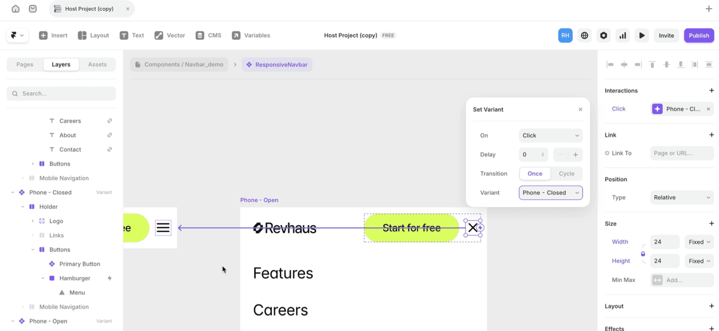
Now your navbar responds to breakpoints and toggles on mobile without any code.
Frequently asked questions
Why does my navbar break on mobile?
Usually because it's not a component with variants. A single frame can't respond to breakpoints the way a component with Desktop/Mobile variants can.
Do I need code for a hamburger menu?
No. The variant swap interaction handles the toggle without any code. On Click → Change Variant is all you need.
What width should I set for the mobile variant?
390px matches iPhone 14 - the most common mobile viewport. 375px works for older iPhones.
Why are my nav links not linking correctly?
Make sure each text layer has a proper link assigned in the properties panel under the Link field - not just styled as a link colour.
Should I use fixed or sticky positioning for the navbar?
Fixed keeps it visible while scrolling regardless of page position. Sticky keeps it in flow and only becomes fixed when it hits the top. Fixed is simpler and more predictable for most navbars.
Why does my sticky navbar stop working?
Check the overflow setting on every parent frame in the layer tree. A parent set to Hidden overflow will break sticky positioning on any child inside it. Change Hidden to Clip.
How do I learn Framer?
Honestly, the best place to start is just right inside Framer - keep building stuff. If you want a structured path from zero to client-ready sites, that's what we built the Ultimate Framer Masterclass for. 100+ lessons, updated as Framer evolves.
KEEP READING

11 Framer Features Worth Actually Understanding in 2026
Framer moves fast. Here are 11 features worth actually getting your head around - what they do, how to use them, and why they matter.
Ryan Hayward

Frameship 2.0 Update
Frameship has had HUGE upgrades

Georgia Back

How to manage projects in Framer
Project management can get out of hand quick, here are our best tips to keep everything on track

Insert Frame