setup
COMPONENTS
INTEGRATIONS
FAQ
Filter Dropdown - Superfields for Framer
Filter Dropdown is a space-saving, single-select filter - ideal when you have a longer list of options.
Before you start: every input works together with the Superfields Collection - the main component that connects your CMS and renders the results. Add and connect that first (see Getting Started with Superfields), then give this input the same ID Filter Group as your collection.
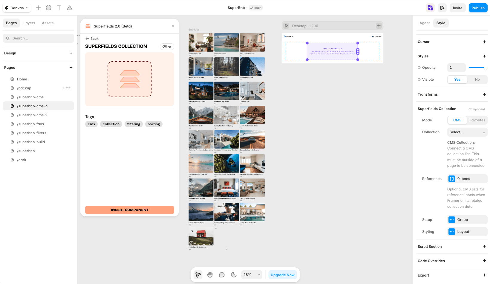
Where to use it
Airbnb-style rentals: city or region, where there are too many options for buttons.
Job board: department or seniority level.
Directory: country, industry or category.
Best for longer option lists where buttons would take up too much space.
Add Filter Dropdown
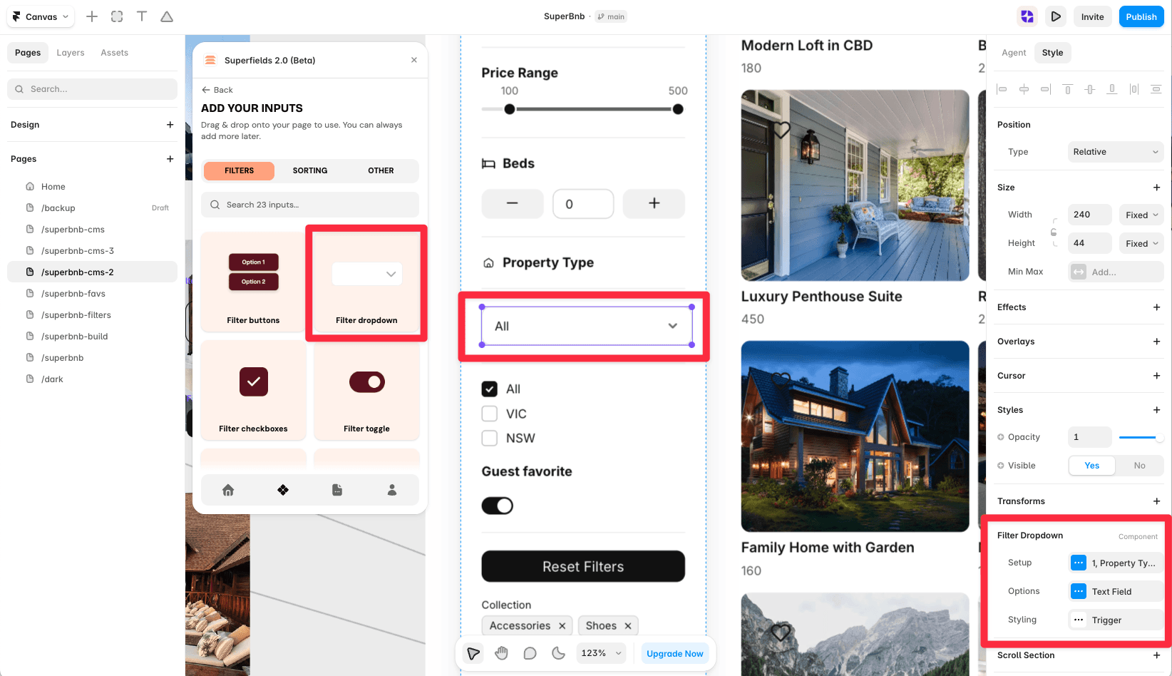
Open the Superfields plugin and go to Components, then the Filters tab.
Drag Filter Dropdown onto your page, inside your filters layout.
Open the component's Setup from the
...menu.
Setup
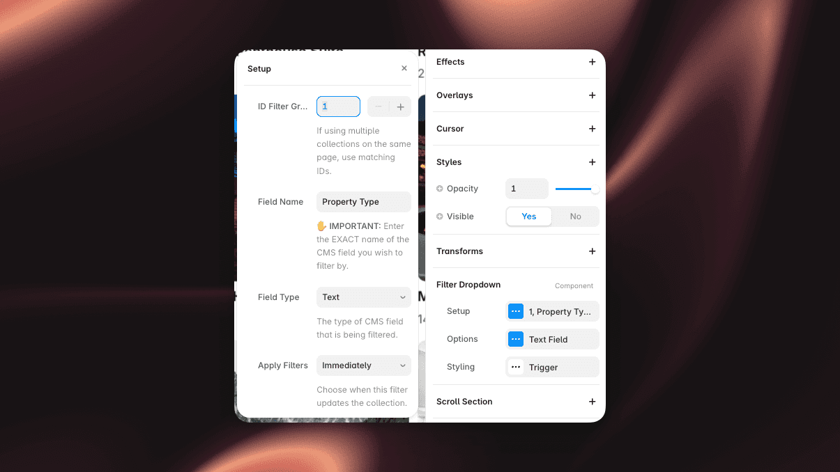
ID Filter Group - must match your Superfields Collection and other filter controls.
Field Name - the exact CMS field name to filter by.
Field Type - Text, Option or Toggle.
Options
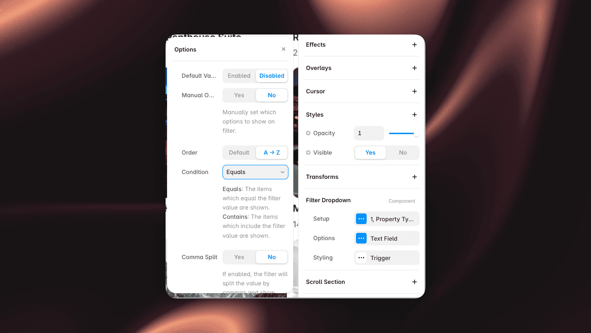
Default Value - pre-apply a value on load.
Manual Options - hand-pick which options appear, or leave off to generate them from the CMS.
Order - Default or A to Z.
Condition - Equals or Contains.
Styling
Style the dropdown Trigger: Fill, Border, Radius, Padding, Text (colour and font) and the Chevron icon size.
And that's it - a clean, compact filter for your collection.


