setup
COMPONENTS
INTEGRATIONS
FAQ
Filter Checkboxes - Superfields for Framer
Filter Checkboxes let visitors tick one or more values to filter your collection - perfect for multi-select filtering like disciplines, amenities or tags.
Before you start: every input works together with the Superfields Collection - the main component that connects your CMS and renders the results. Add and connect that first (see Getting Started with Superfields), then give this input the same ID Filter Group as your collection.
Where to use it
Airbnb-style rentals: amenities - Wi-Fi, pool, parking, pet friendly - where guests tick several at once.
Online store: brand or size, letting shoppers select multiple.
Events listing: multiple categories or tags.
Best when visitors need to combine several values in one filter.
Add Filter Checkboxes
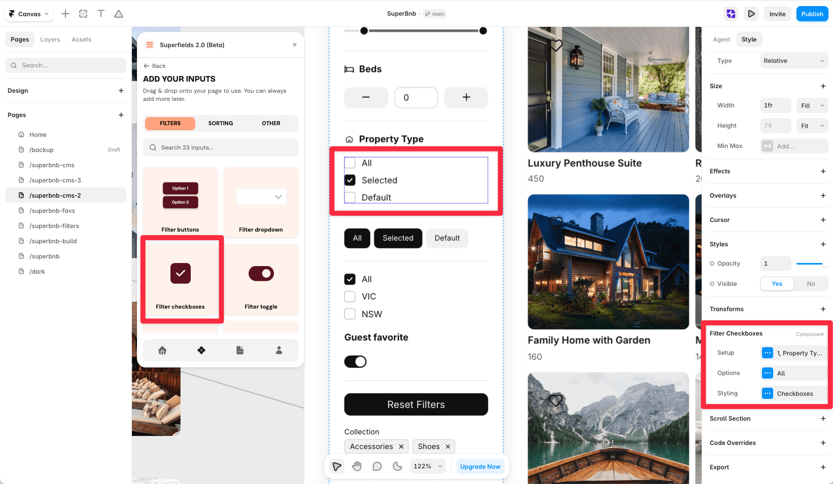
Open the Superfields plugin and go to Components, then the Filters tab.
Drag Filter Checkboxes onto your page, inside your filters layout.
Open the component's Setup from the
...menu.
Setup
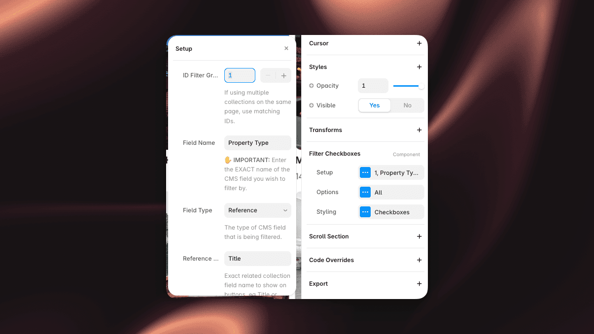
ID Filter Group - must match your Superfields Collection and other filter controls.
Field Name - the exact CMS field name to filter by.
Field Type - Text, Option or Toggle.
Options
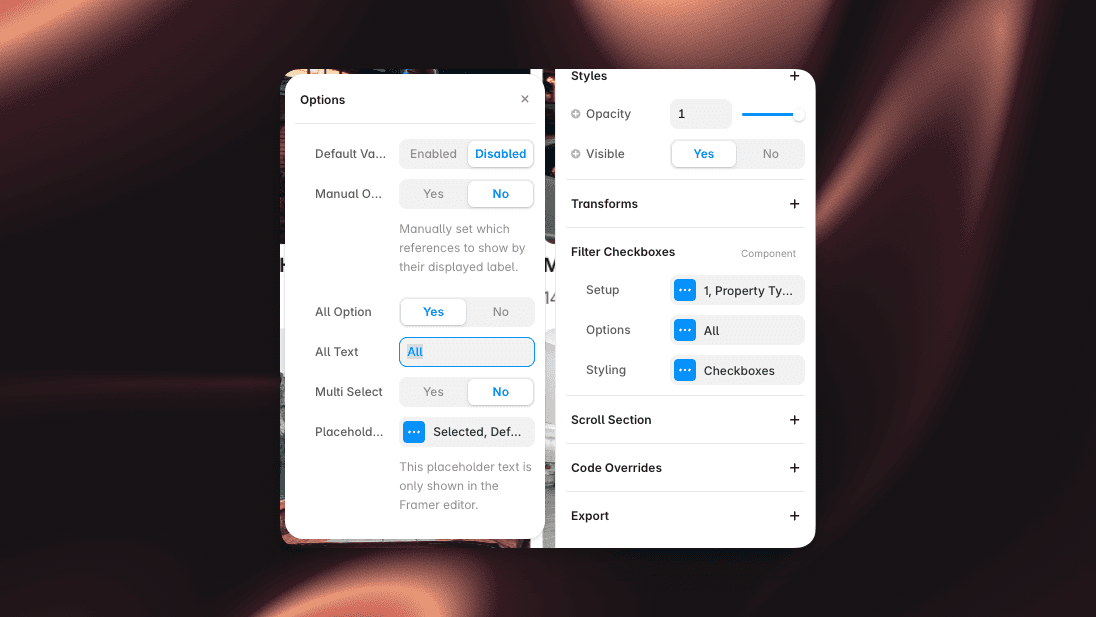
Default Value - pre-select a value on load.
Manual Options - hand-author the list (reorderable, with Add), or generate it from the CMS with an Order control (Default or A to Z).
Condition - Equals or Contains.
All Option - add an "All" choice.
Multi Select - allow more than one box ticked at once.
Styling
Style the Box, Text, Row and Layout. The Row panel controls Padding, Gap, Radius and the On/Off fills (checked vs unchecked colours).
And that's it - multi-select filtering, styled to your brand.


