setup
COMPONENTS
INTEGRATIONS
FAQ
Filter Buttons - Superfields for Framer
Filter Buttons render your filter options as a row of tappable pills - great for short option lists like categories or tags.
Before you start: every input works together with the Superfields Collection - the main component that connects your CMS and renders the results. Add and connect that first (see Getting Started with Superfields), then give this input the same ID Filter Group as your collection.
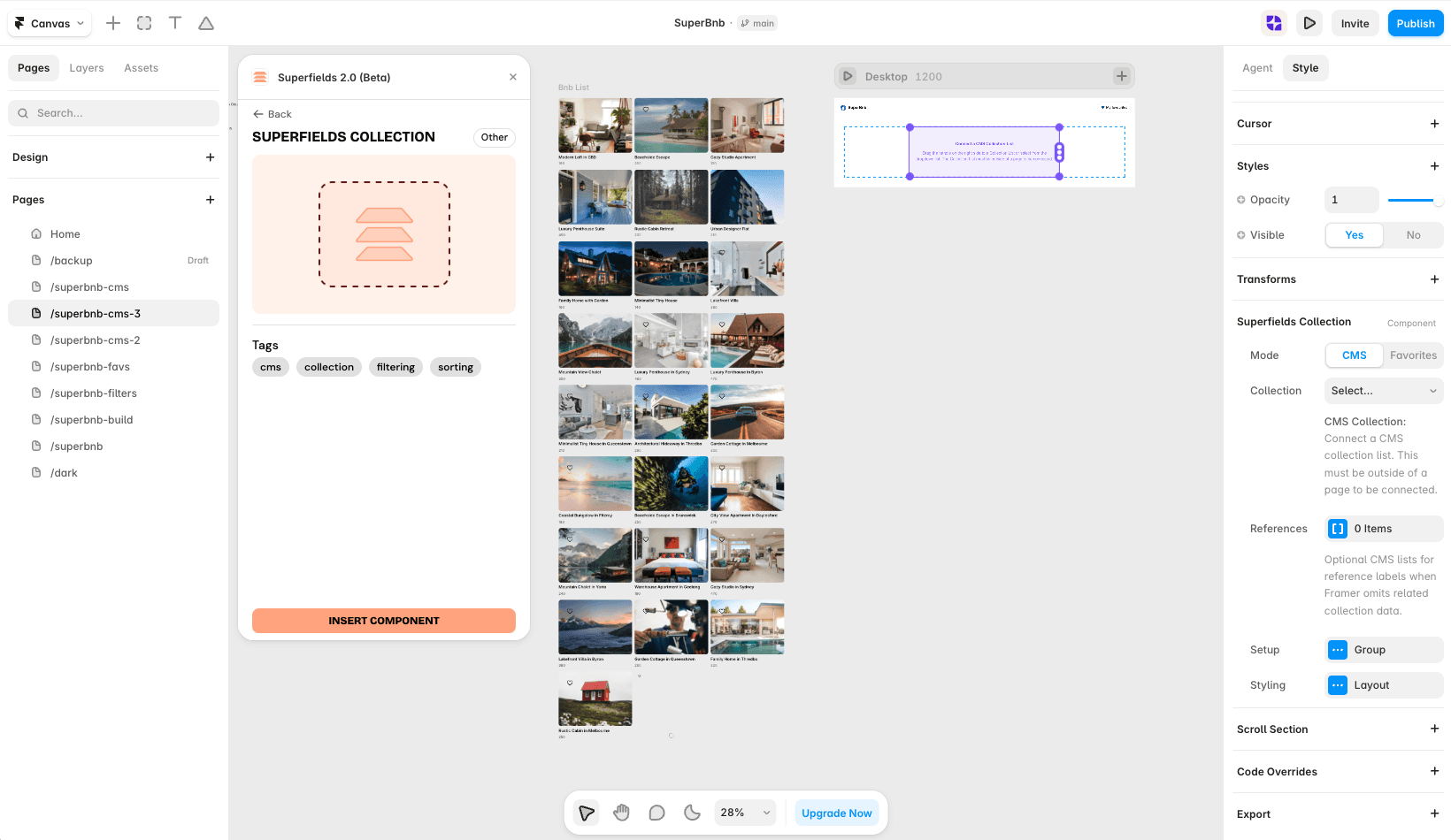
Where to use it
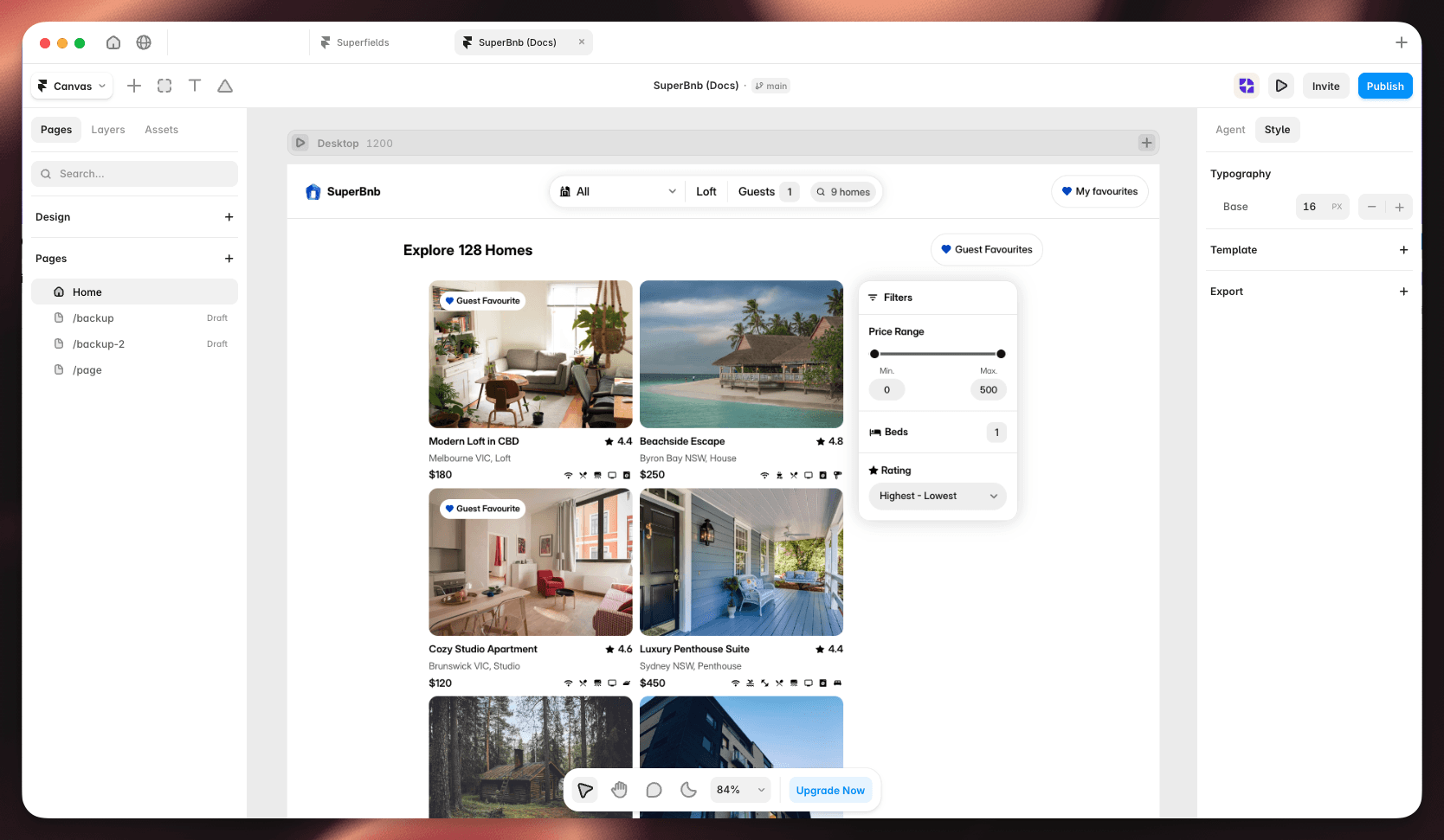
Airbnb-style rentals: property type - House, Apartment, Cabin.
Online store: top-level category - Shoes, Apparel, Accessories.
Blog or resource library: post type - Guides, News, Case studies.
Best for short option lists where you want every choice visible at a glance.
Add Filter Buttons
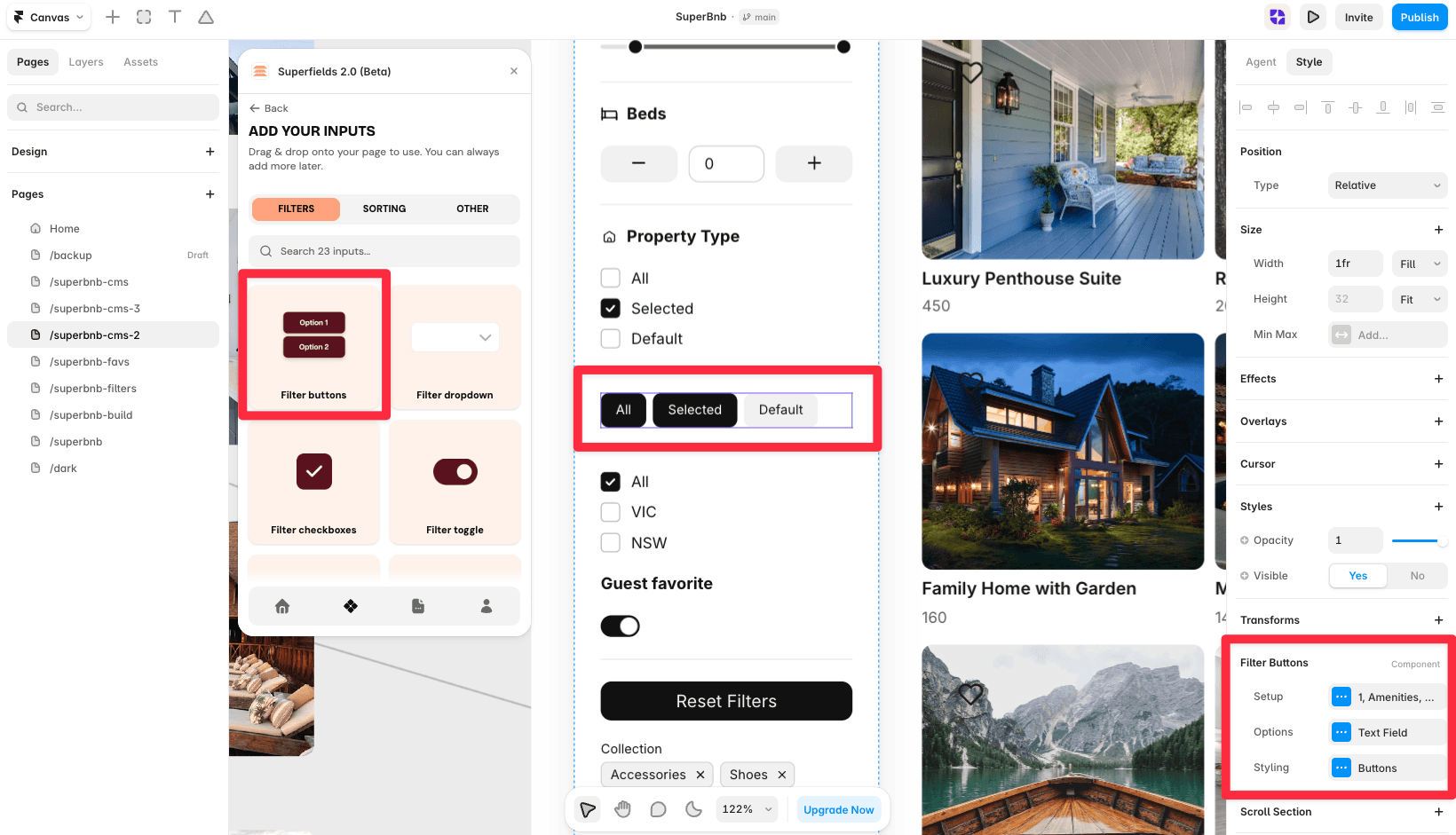
Open the Superfields plugin and go to Components, then the Filters tab.
Drag Filter Buttons onto your page, inside your filters layout.
Open the component's Setup from the
...menu.
Setup
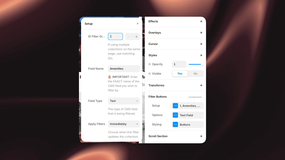
ID Filter Group - must match your Superfields Collection and other filter controls so they act on the same results.
Field Name - the exact name of the CMS field you're filtering by (spelling and case must match).
Field Type - Text, Option or Toggle, matching the CMS field.
Options

Default Value - pre-select a value when the page loads.
Manual Options - turn on to hand-author the button list (a reorderable list with Add), or leave off to pull options automatically from the CMS field.
Order - Default or A to Z.
Condition - Equals (exact match) or Contains (partial match).
All Option - add an "All" button that clears the filter.
Styling
Style the Buttons: Width Type (Fit / Fill / Fixed), Height, Padding, Fill, Text, Border and Radius. Each button has selected and default states so active choices stand out.
And that's it - your visitors can now filter your collection with a tap.


